US Corn Yields
Published at Mar 26, 2022
Summary
Because I grew up on a farm and have always been interested in agriculture, I wanted to take a look at corn yields and how they were effected by variables in data that I could find. Luckily the USDA has a relatively extensive dataset on crop production and yields by state and also includes information such as if the crops were irrigated or not. They have a query tool which I used to get the raw data which is also available in this GitHub repo. They also have an API that I may attempt to make more use of in the future. With the data gathered I wanted to understand how the corn yields have changed over time and what variables were important for corn yields (what area and if the land was irrigated or not).
I would also like also mention that analyzing this data was a good way for me to practice methods that I learned in my regression analysis, hence the strong focus on linear models in this analysis.
If you would like to see the code for the analysis, you can go to my GitHub repo. For this post, I will leave the code out and we will focus on the methodology and results
Data Exploration
After preparing the data so (splitting strings, and some pivoting) we can take a look at the corn yields for the states which the USDA has data available for. Note that the data I used had production in bushels and acres harvested, which I used to calculate the yield in bushels per acre (bu/acre). The raw data gave these measures for each state per year where I had queried for data after 1950. The data also specified if the grain corn was grown on irrigated or non-irrigated land.
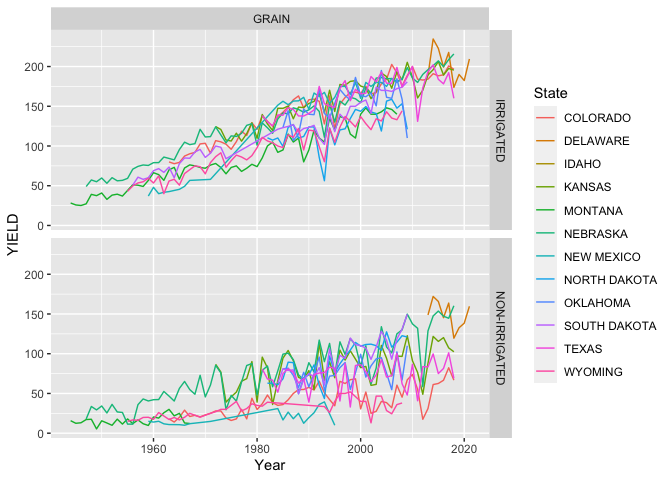
From the plot above we can see that the grain corn yields have improved dramatically over time! Because there are quite a few states, I will group some states which I think more alike (places like Wyoming, Montana and Idaho vs. Nebraska and Kansas). It is likely that there could be other methods used to find groupings which maximize the differences between each group of states; this was not used in this analysis as I was focused on regression analysis and I will use my intuition in this case.
Data Aggregation
I will group the states according to this table:
| State | Area |
|---|---|
| Colorado | MTN_WEST |
| Wyoming | MTN_WEST |
| Idaho | MTN_WEST |
| Montana | MTN_WEST |
| New Mexico | SOUTH |
| Texas | SOUTH |
| Oklahoma | SOUTH |
| Nebraska | MID_WEST |
| Kasas | MID_WEST |
| South Dakota | MID_WEST |
| North Dakota | MID_WEST |
| Delaware | EAST |
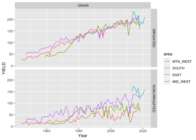
Now that we grouped states based on my perceived similarity we can see some of the trends and differences a little easier. We should note how similar the areas are for yields where the land is irrigated after 1980 while there are some differences prior to 1980. It is also interesting to note how different each areas non-irrigated acreage performs (my guess would be due to rainfall amounts and potentially temperatures). Also note how the yields for the non-irrigated acreage appears significantly lower than that of the irrigated acreage, this should not be surprising. Another observation to take stock of is the short period of time that the Eastern states (really just one - Delaware) have data available for; we could remove this, but I will leave it in for now with the reminder to look at the standard errors in our model. Now let’s use a linear regression model to see if we can parse out the effects of the area, irrigation, and time.
:warning: Confounders! Something to be aware of as we move forward is that time, or specifically, the year that the corn was planted and harvested appears to have a large effect on the yields. There is no physical reason why corn with all the same trgeatments (irrigation, fertilization, pest control, etc.) would yield more grain in 2020 in comparison to 1980. I say this because there are many confounding variables that are not present in this data set such as fertilizer use, pest control, and crop rotation practices which have increase yields over time as we have continually discovered better farming methods to increase the yields of our crops. This presents a spurious relationship between the year that the crop was planted and harvested and the observed yeilds.
Ordinary Least Squares (OLS) Regression
When we think of regression, OLS is the method we are typically thinking of. I will start with a simple model which follows the equation written below
Where the expectation of
In this case True and False. In R the True and False (we only need n-1 dummys to fully specify n levels in a categorical variable) and a different coefficient will be calculated for each dummy variable. We can also think about our estimates
Something to notice in the model stated is that we have not yet stated anything about the distribution of any of the parameters in the model, which is okay at this point. Two key assumptions we currently have and will have to verify is that our samples are independent (
With that said you will see summaries of the model which will include plenty of t-tests and F-tests on the model and coefficients as well as confidence intervals. For these to be valid we need to assume (and verify) that our residuals are normally distributed such that
Additive Model
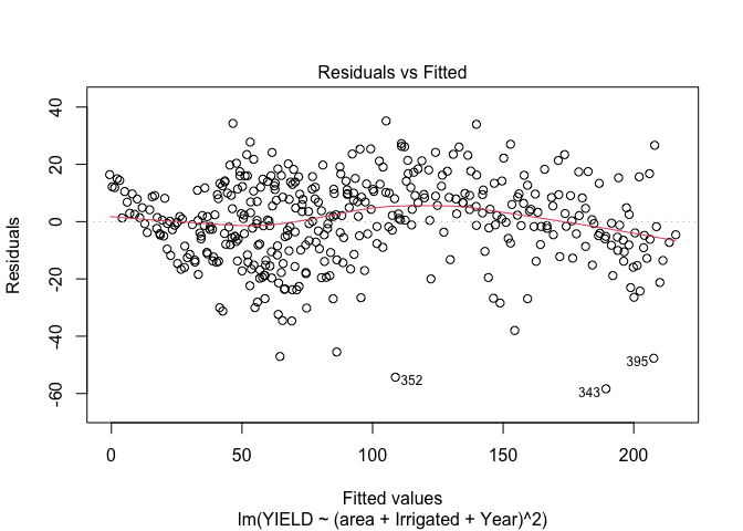
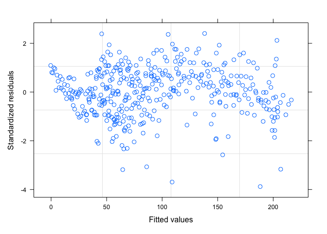
Once I fit the model, we need to take a look at our assumptions, one of the first things to look at is a scatter plot of the residuals vs. the fitted values. Do you see anything worrisome?
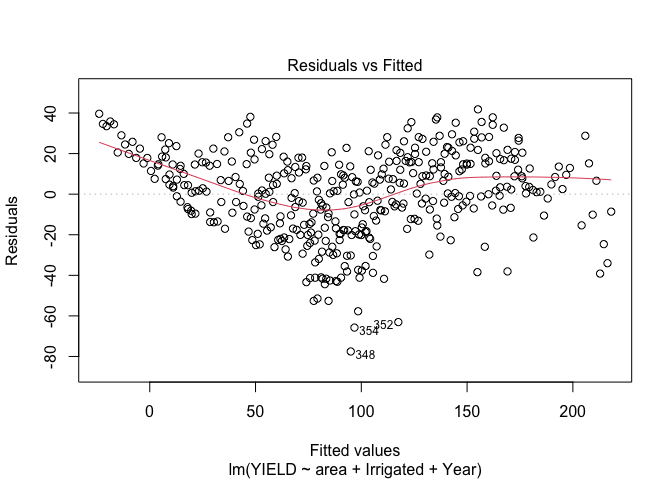
Here it looks to me as if there is a trend in the mean of the residuals, indicating to me that we either need to consider some transformations or other terms in the model. So, our
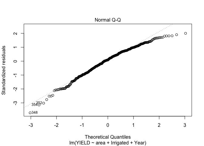
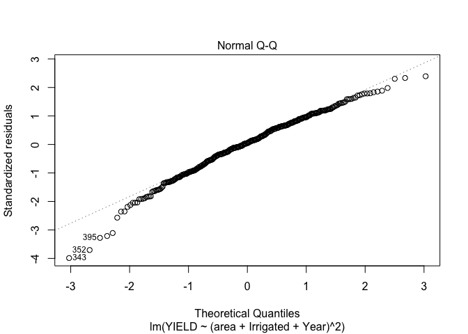
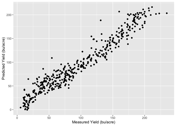
Unfortunately it looks like our points are not quite normally distributed either. Lets see how well we are predicting the yeilds with our current model, to do this I will look at a plot of the predicted yields vs. the measured yields.
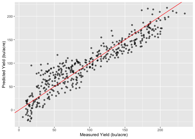
From this plot it looks like our model isn’t doing too horrible; we can see some of the effects from our residuals, but if we can take care of our assumptions we appear to be on the right track.
In summary the plots above show the model does a reasonable job of predicting the yield, however the residual plots show that there certainly is room for improvement. We have some trends in the mean of the residuals vs. the predicted values and the QQ plot shows that they are not normally distributed around the mean. There may also be some issues with the assumption around constant variance, and if we look closely at the plots above showing the production and yields over time we may suspect that the residuals are correlated and not independent. This means we’re breaking a lot, if not all, of our assumptions. Lets see if we can get in a little better position by allowing the categorical variables to have a multiplicative influence instead (so they can change the slope of the line) instead of having only an additive influence which allows them to only change the intercept. My hope is this model will help addres some of the trends that we see in our residual plots.
Multiplicative model
Luckily R makes it easy to add the multiplicative influence by asking R to fit a model with all of the interactions as shown below. As mentioned above, this allows for the categorical values to influence not only the intercept but also the slope of yield over time. Now when we write our model out, it looks something more like this:
Now when we take a look at our residuals vs. fitted values, the trend in the mean is much better (there still is a little bit there, but likely due to the auto-correlation I will discuss later). We do still see non-constant variance which will have to be addressed.
Our QQ plot while not perfect still looks better.
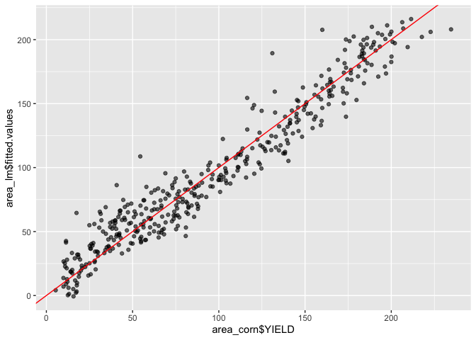
It looks like our model is still doing a reasonable job of predicting the yields as well
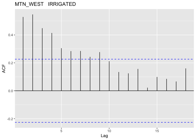
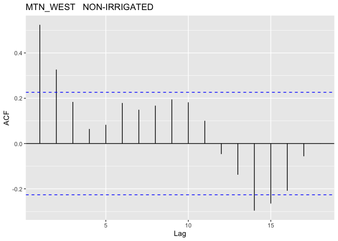
The above plots show that this model better, we don’t have quite as bad of a trend in the mean of our residuals and our QQ-plot while not great is looking like we’re getting a little closer to normally distributed. With that said we should look into the potential for autocorrelation for our groups. In R this could be done with the acf() function, which I will have applied to each distinct group (since we want unique time periods to evaluate autocorrelation).
Note: I did not plot the autocorrelation for the EAST region since there is very little data for that region
 |  |
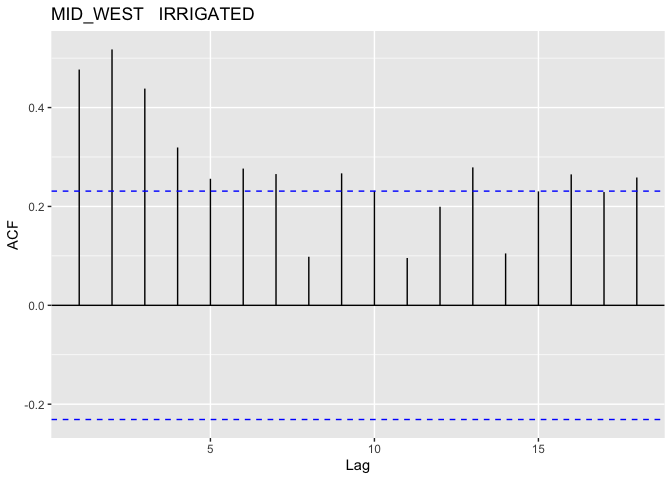 | 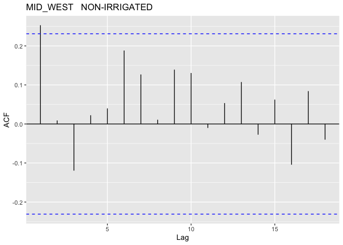 |
As suspected, it looks like we do have some pretty serious auto-correlation issues to deal with; these most definitely cannot be ignored. In order to address this I will use of Generalized Least Squares (GLS).
Generalized Least Squares (GLS)
For the linear regression model above we assumed that
However in generalized least squares (GLS), we can use any structure for the covariance matrix, so we can write
Where
In R this is easy to do with the gls() function from the nlme library, and we can specify the covariance structure with the model corAR1() also from the nlme library. Below is the resulting predicted vs. measured value plot as well as the standardized residuals vs. fitted values.
Model Summary:
| Value | Standard Error | t-value | p-value | |
|---|---|---|---|---|
| (Intercept) | -4318.73 | 194.74 | -22.18 | 0.000 |
| Year | 2.24 | 0.10 | 22.78 | 0.000 |
| areaSOUTH | -793.42 | 293.92 | -2.70 | 0.007 |
| areaEAST | 5609.12 | 3414.58 | 1.64 | 0.101 |
| areaMID_WEST | -454.98 | 237.85 | -1.91 | 0.057 |
| IrrigatedNON-IRRIGATED | 2463.68 | 213.21 | 11.56 | 0.000 |
| Year:areaSOUTH | 0.40 | 0.15 | 2.68 | 0.008 |
| Year:areaEAST | -2.78 | 1.69 | -1.64 | 0.102 |
| Year:areaMID_WEST | 0.23 | 0.12 | 1.95 | 0.052 |
| Year:IrrigatedNON-IRRIGATED | -1.29 | 0.11 | -11.94 | 0.000 |
| areaSOUTH:IrrigatedNON-IRRIGATED | 18.72 | 5.82 | 3.22 | 0.001 |
| areaEAST:IrrigatedNON-IRRIGATED | 77.04 | 11.22 | 6.87 | 0.000 |
| areaMID_WEST:IrrigatedNON-IRRIGATED | 29.72 | 5.17 | 5.75 | 0.0000.000 |
Model ANOVA:
| DF | F-value | p-value | |
|---|---|---|---|
| (Intercept) | 1 | 7618.5 | 0.0001 |
| Year | 1 | 1347.3 | 0.0001 |
| area | 3 | 36.9 | 0.0001 |
| Irrigated | 1 | 1032.5 | 0.0001 |
| Year:area | 3 | 3.7 | 0.0113 |
| Year:Irrigated | 1 | 112.4 | 0.0001 |
| area:Irrigated | 3 | 21.7 | 0.0001 |
Now that we’ve used GLS to avoid breaking our assumptions we can see a few things:
- The ANOVA summary on the GLS model shows we have strong evidence to conclude that the variables are capturing a significant amount of variance as shown by the very small p-values.
- The 95% confidence interval for
was [0.278, 0.470] does not include 0, so we have strong evidence to conclude that there indeed was autocorrelation present in our residuals. - As mentioned earlier the EAST states (just Delaware) as very little data available, which contributes to the large standard error we see in comparison to the other areas.
Interpreting the model is a little more difficult, with the interaction parameters, but we can see the -1.29 parameter for Year:NON-IRRIGATED more than offsets the addition to the intercept for the non irrigated acres in the time periods we’re interested in. For example even in 1950 (for a MTN_WEST state) the effect of not having irrigation was -53 bu/acre (2463 - 1.29 * 1950), whereas in 2020 it would have been -143 bu/acre. This is slightly offset in areas such as the MID_WEST where ~30 bu/acre was added to the intercept for acreage without irrigation (the EAST has even more, but take a look at that standard error!).
Also take notice that time is a big component! For all of our regions the yield increases by >2 bu/acre/year. We can see in the ANOVA table that it was also responsible for describing a lot of variance relative the the residuals as evidenced by the very large F-value. As dicussed earlier this is likely due to other counfounding variables not accounted for in this analysis.
As we saw before we can also see each area can have a significant impact to the yields. However, while significant, the differences are not nearly as large as those due to irrigation.
Conclusions
Above we have discussed linear regression, it’s main assumptions, and analyzing the residuals to verify those assumptions hold true. We also discussed generalized least squares and how we can use that method to help address concerns identified from OLS which cannot be addressed through other methods such as transformations.
We also found that the area that corn is being produced from has a significant factor on yields as does irrigation. Time was also found to explain a lot of variance in the model but we also covered the presence of confounding variables such as technology and farming practices that have changed over time and helped improve yields.